
Another great tutorial from Jo Robinson 👍😃
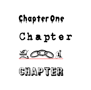
There are lots of fabulous fonts around these days for us to use in our paperback books, and I think that making them visually attractive as well as wonderful to read is a great idea. Using a plain font for most of the body text is best, but there is no reason not to create great looking chapter headings, or using old typewriter fonts to make letters or notes stand out in your stories. Some fonts are made by hobbyists and offered online free for use commercially so it’s always necessary to check that they are embedded in your manuscript when you load it up to CreateSpace or any other POD system.
CreateSpace says,
“In order to print your book, our printing presses need information about how to properly render the fonts used in your file. Information about fonts is not always included in documents by default, and you may…
View original post 158 more words

Excellent tutorial by Jo. Shared on Google+. Thanks Chris. 👍
LikeLiked by 1 person
Welcome Tracy 😃
LikeLike