
You’ve been toiling for hours upon hours. Edited to a glossy shine, your manuscript is finally complete.
Unfortunately, a complete manuscript is not the same thing as a book interior. The difference is formatting.
If a complete manuscript is your masterpiece, consider formatting the frame in which your masterpiece is viewed. Proper framing enhances the work, while improper framing detracts. Even worse, nothing screams amateur quite as loudly as improper framing.
So how does one ensure proper framing?
For one, start sweating the details.
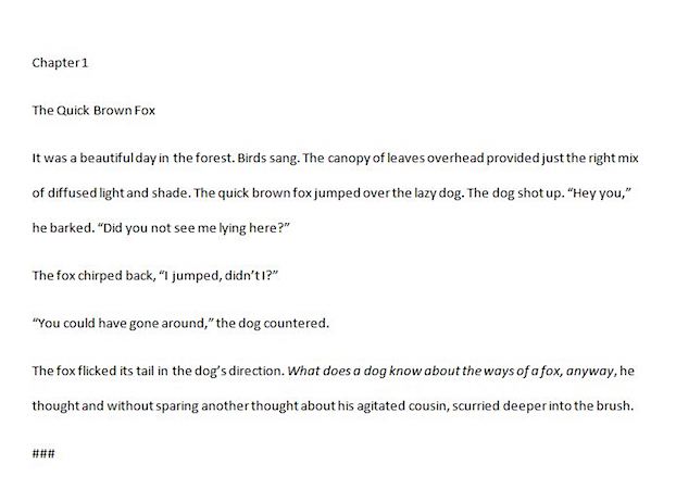
This example shows basic text written left justified on 8×11 paper. It is readable, but there is nothing to pull the eye to the page, let alone, a reader into a story.
-
Adjust your page size
When setting your book up for publishing you will be asked to specify a trim size, which is a fancy way of saying set your page length and width. You can read or watch a video about how to set up page size and margins as well as download a template if you are starting from scratch at https://www.diggypod.com/how-to-publish-a-book/templates-and-margins/
-
Draw readers in before they read the first word
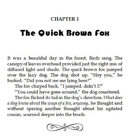
Chapter headings should stand out from the rest of the text. This can be done by increasing font size, going bold, or utilizing a different font altogether. You can also add drama by adjusting the negative space on the page, otherwise known as white space, or non-printed space.
You can do this by adding a bunch of carriage returns (or hitting the enter key a highlighting text and changing the font. But the best way to do this is by utizing and modifying Word’s built in styles. This will allow you to tweak the appearance of your text all at once without having to worry about adjusting everything one by one at the page level. The basic steps can be found here: http://www.gcflearnfree.org/word2016/applying-and-modifying-styles/1/

-
Add page numbers and headers
This comes down to a matter of personal preference. Some people like their page numbers in the upper corners. Some like theirs in the middle of the page bottom. A good strategy is to look at other books in your genre, especially the ones that you want to emulate, and do whatever it is they do.
-
Set it apart from the competition (in a good way)
In my example story, I originally used a ### to make it clear to the reader that there is a break in the scene. These characters get that point across, as would a dotted line or asterix (*), but I could just as easily use this space to reinforce my book’s branding by inserting an alternate symbol like an infinity or omega sign, an image or decorative flourish instead. Caution – images of less than 300dpi may appear blurry. If you do want to use an image or decorative flourish and want it to retain its crispy appearance, I highly recommend first running it through a tool such as https://convert.town/image-dpi before adding it to your document.
Also – be sure that any images used are licensed for public and commercial use under Creative Commons. If you aren’t sure about an image’s license and you didn’t create it yourself. Don’t use it.
Now if you are like me, and use almost as many scene breaks as you use chapters, this step can seem quite daunting which is why Word’s Find and Replace feature may just be your new best friend.
But isn’t Find and Replace only for tasks like changing character names?
Oh no.
-
Click on Ctrl+H to find the first instance of your section break character
-
Highlight your text
-
Use the Insert tool menu to insert your desired symbol.
-
Adjust the size until you are satisfied by its appearance on the page.
-
Click on the image and either right click and select copy or hit Ctrl+C to add your image to the clipboard
-
Click on Ctrl+H once again. Your last search should still be in the window
-
Where it says Replace with: type ^c
-
Click on the button that says Replace All
If you decide you want to use a different image after replacing all or if you want to use a symbol or special character instead, simply type ^g in the Find box to instruct Word to look for graphics.
Voila. Your frame is now ready for mounting on your wall.

Amazon:

. Thanks, Allie and Chris for this helpful information.
LikeLiked by 1 person
Welcome, Harold 😃
LikeLike
. Carriage returns (and character spacing for tabs) can cause problems with eBooks and Print on Demand because the software may translate them differently.
LikeLiked by 1 person
Such awesome info here, Allie. Thanks for sharing. Formatting is the stuff of nightmares. This is super helpful. 🙂
LikeLiked by 1 person
Thanks, Allie and Chris for this helpful information. 🙂 — Suzanne
LikeLiked by 2 people
Wish I’d had this info for my first book! Thanks though!
LikeLiked by 2 people
This is AMAZING! Thank you for this!
LikeLiked by 2 people
Reblogged this on Kate McClelland.
LikeLiked by 1 person
Thanks for sharing, Kate 😀
LikeLiked by 1 person
Thanks for this important info, Chris!
Peace,
Sherrie
Sherrie Miranda’s historically based, coming of age, Adventure novel “Secrets & Lies in El Salvador” is about an American girl in war-torn El Salvador:
http://tinyurl.com/klxbt4y
Her husband made a video for her novel. He wrote the song too:
https://www.youtube.com/watch?v=P11Ch5chkAc 😉
LikeLiked by 2 people
Carriage returns? No, no. Almost every word processor, even Scrivener, allows you to set spacing before and after paragraphs and save them as a style (meaning you can correct every paragraph with that style with a single settings change). Carriage returns (and character spacing for tabs) can cause problems with eBooks and Print on Demand because the software may translate them differently.
LikeLiked by 2 people
I’m definitely not advocating them either for the reasons you mention. I was only saying you could do it that way, not that you should.
LikeLiked by 1 person
Reblogged this on Die Erste Eslarner Zeitung – Aus und über Eslarn, sowie die bayerisch-tschechische Region!.
LikeLiked by 2 people