
KERNING ANYONE?
Kerning
The spacing between letters sometimes doesn’t look quite right to the eye. Kerning is the art of adjusting the spacing between individual letters in order to improve visual appeal.
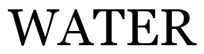
Certain pairs of letters can be especially problematic. For example, consider the word WATER written in uppercase letters. If you look closely, you will see a noticeable gap in the pair WA, while the letters TE are nearly touching.
Contents
- Kerning Example
- Does it Matter?
- Kerning in Word
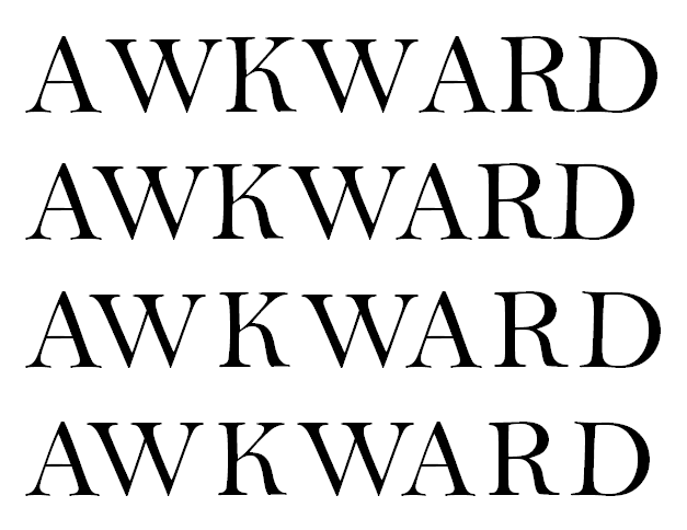
1. Kerning Example
Inconsistent spacing between letters arises from the shape of the letters. The W is slanting toward the A, which slants away from the W. The process of typing generally creates each letter in its own little block. The W and A blocks force a minimum separation, unless kerning is applied. See the image below.
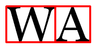
Through kerning, the space between the W and A can be decreased, as in the…
View original post 856 more words
